hello@elierachkidi.com
+33 7 51 26 99 27
Elie Rachkidi © 2022


menu
close
IO.Point is a continuation of FLIXPY's goal to minimize our CO2 emissions in the environment. Through our research, we found that our impact on the environment doesn't only come from our production, but also from the methods we use to distribute it. That's where IO.Point comes in. Utilizing FLIXPY's easy and compact rebranding kit, it provides brand managers with a simple tool to manage their campaigns efficiently.
Unmanaged logistics can be harmful to the environment. Poor planning and inadequate practices can lead to increased emissions and waste. Sustainability should be a priority in logistics management to minimize environmental impact.
We are using technology to develop an app that enhances logistics and communication between field force and office managers. This will save time, reduce CO2 emissions, and save money. The app will streamline processes and provide real-time updates to improve efficiency and reduce the need for physical meetings and travel. By utilizing this technology, we can not only improve our operations but also do our part in protecting the environment.
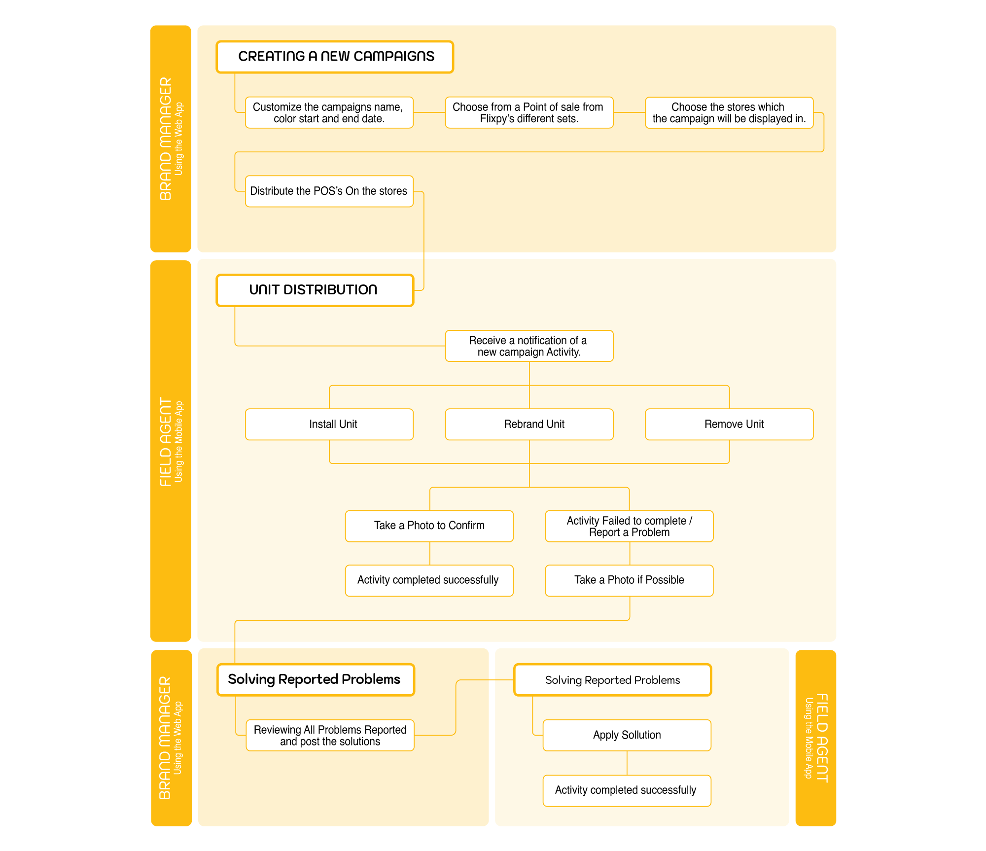
We have created a map of the process for installing a POS, including any potential issues that may arise. This map serves as the foundation for our platform and has made it clear what functionalities we need to design in order to streamline the installation process and anticipate and resolve any issues that may arise.
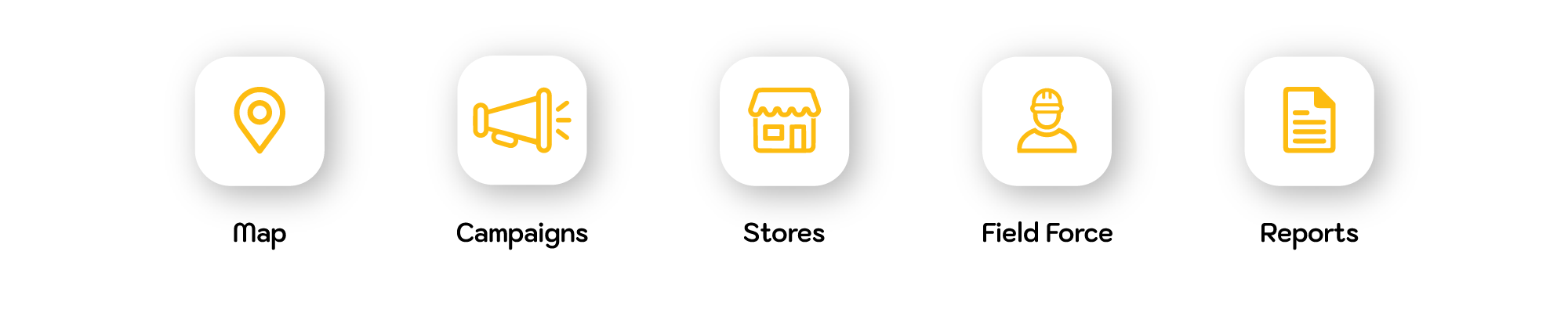
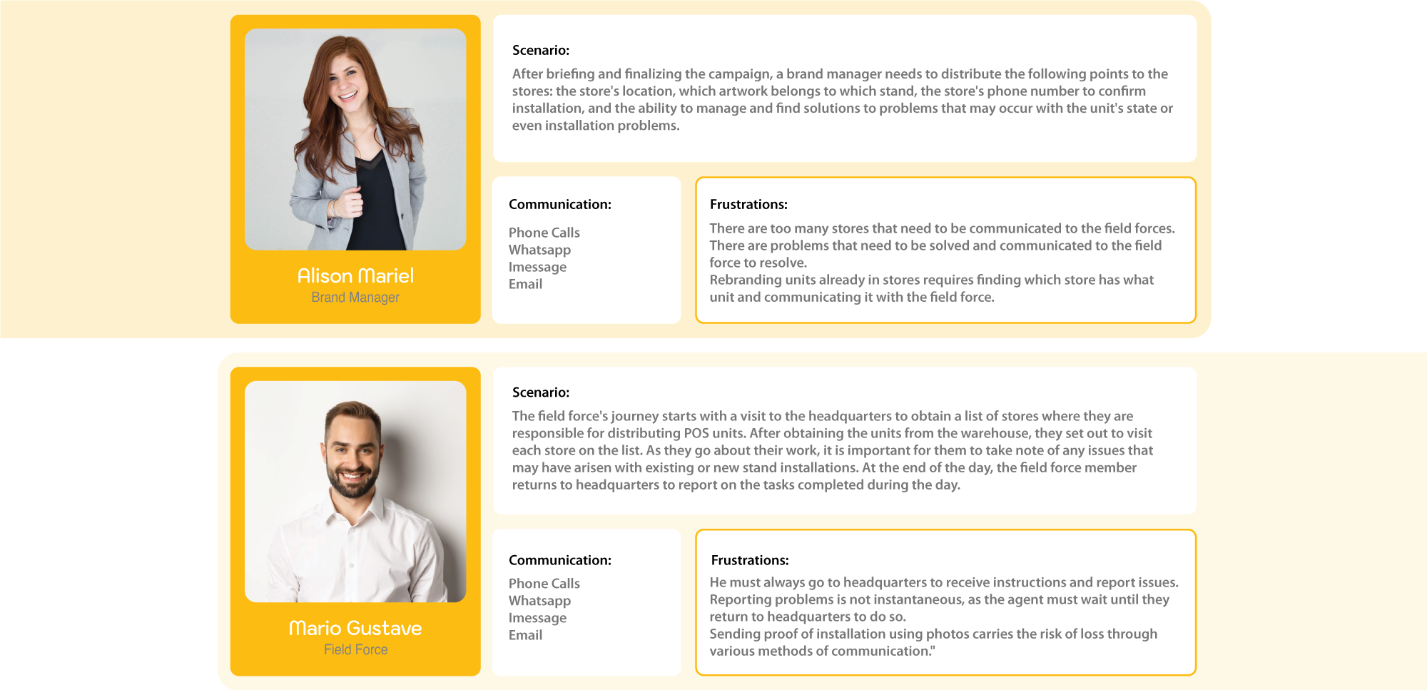
Through careful analysis and brainstorming of data gathered from field force and managers, we were able to identify the problem and provide a solution by dividing it into five main categories. These categories will serve as the main Functions of our platform.
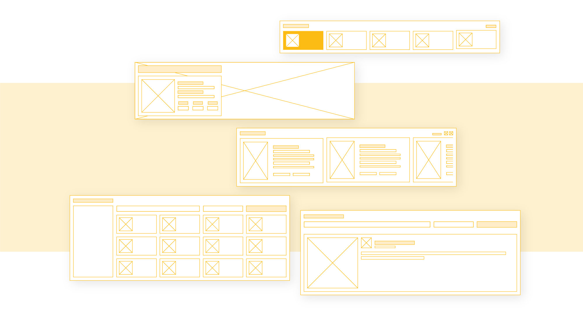
I utilized the wireframing process to create a visual representation of the product's user interface. This helped to establish the layout, hierarchy, and functionality of the design. By wireframing the product, I was able to iterate and test the design before moving on to the development phase, ensuring that the final product was user-friendly and effective.
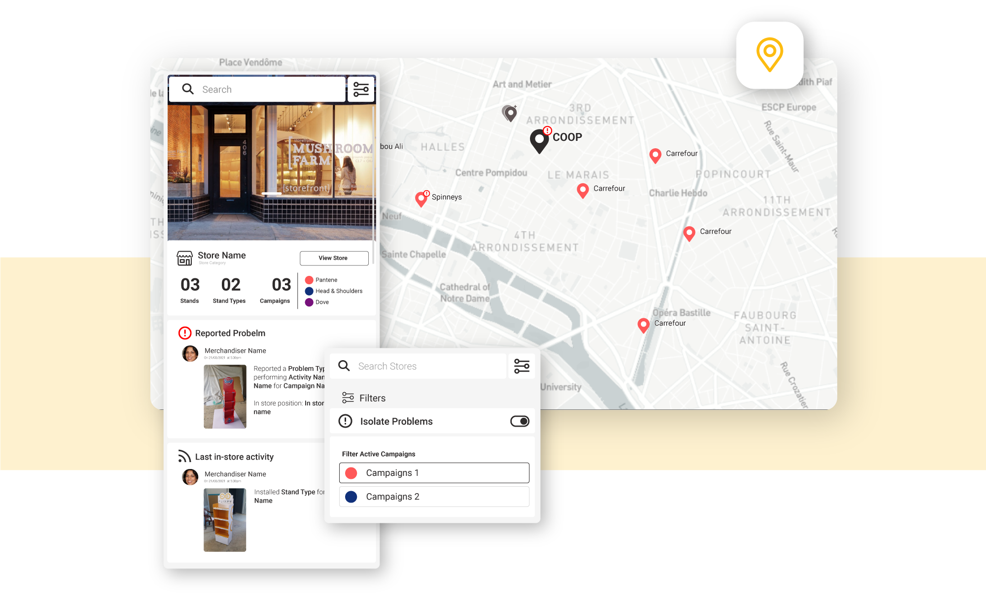
I created a map that displays all stores within our network, using color-coded markers to differentiate between campaigns. By clicking on a store, users can access a detailed page on the side while still maintaining the map view. This map is similar to Google Maps, but specifically tailored to our store network. Users can also filter stores by campaign name or view only those stores that have reported issues and require feedback from a manager.
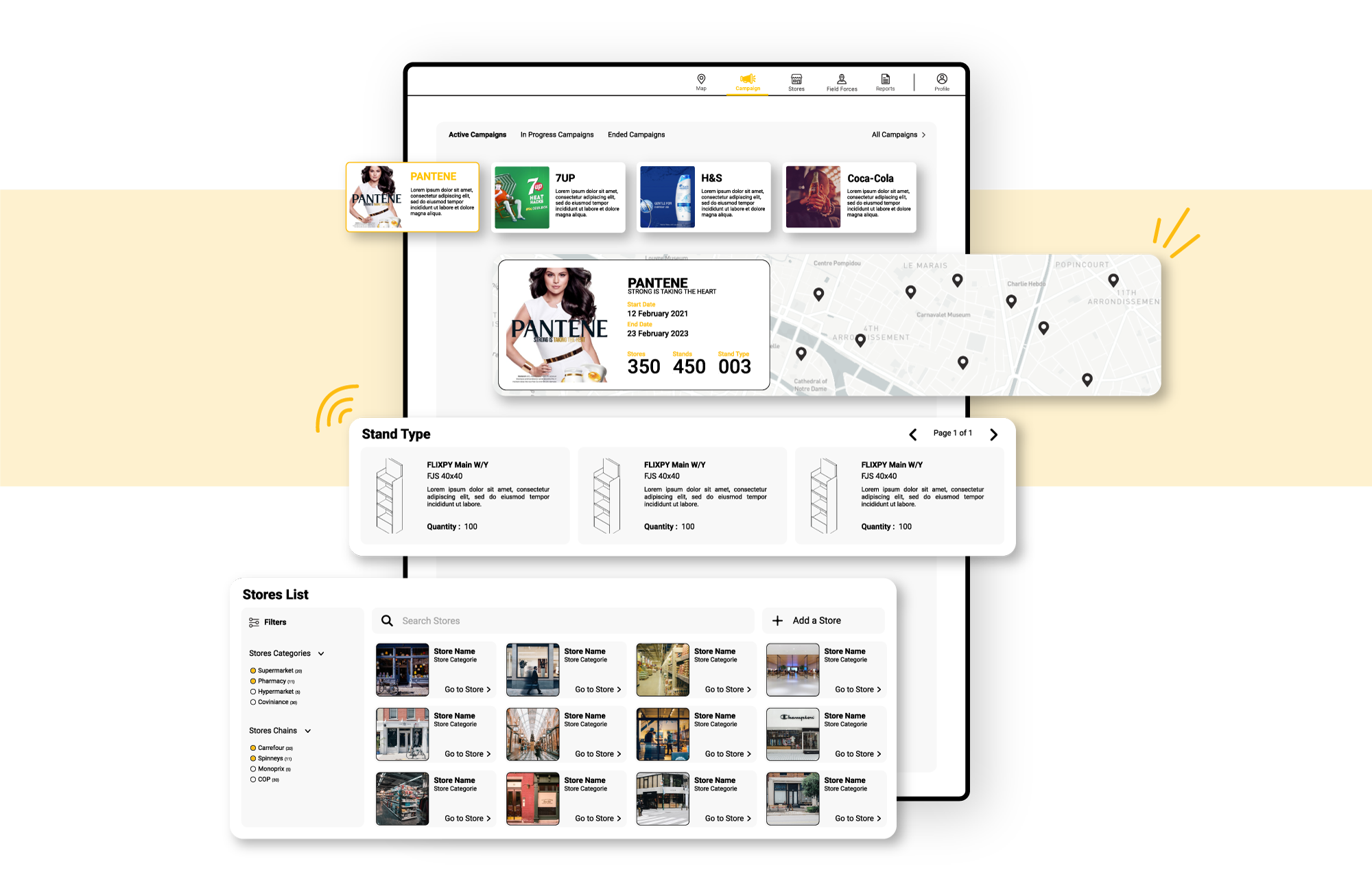
The detail campaign page allows a manager to view live updates about their campaign. This includes the campaign start and end dates, details about the campaign, the type of POS involved, and a list of stores participating in the campaign. The page also includes a live feed of all reported problems, where the manager can provide comments and instructions to the field force in real-time.
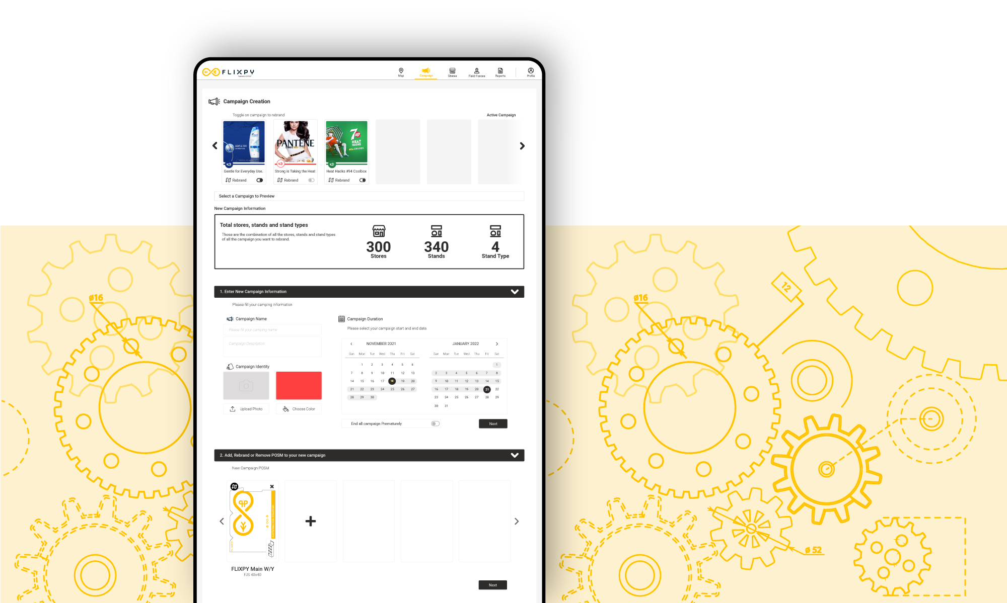
Creating a campaign process was challenging as we had to consider every step and piece of information that would be useful for the platform, while also keeping it as simple as possible for users to navigate. It was important to strike a balance between including all necessary details and maintaining ease of use.
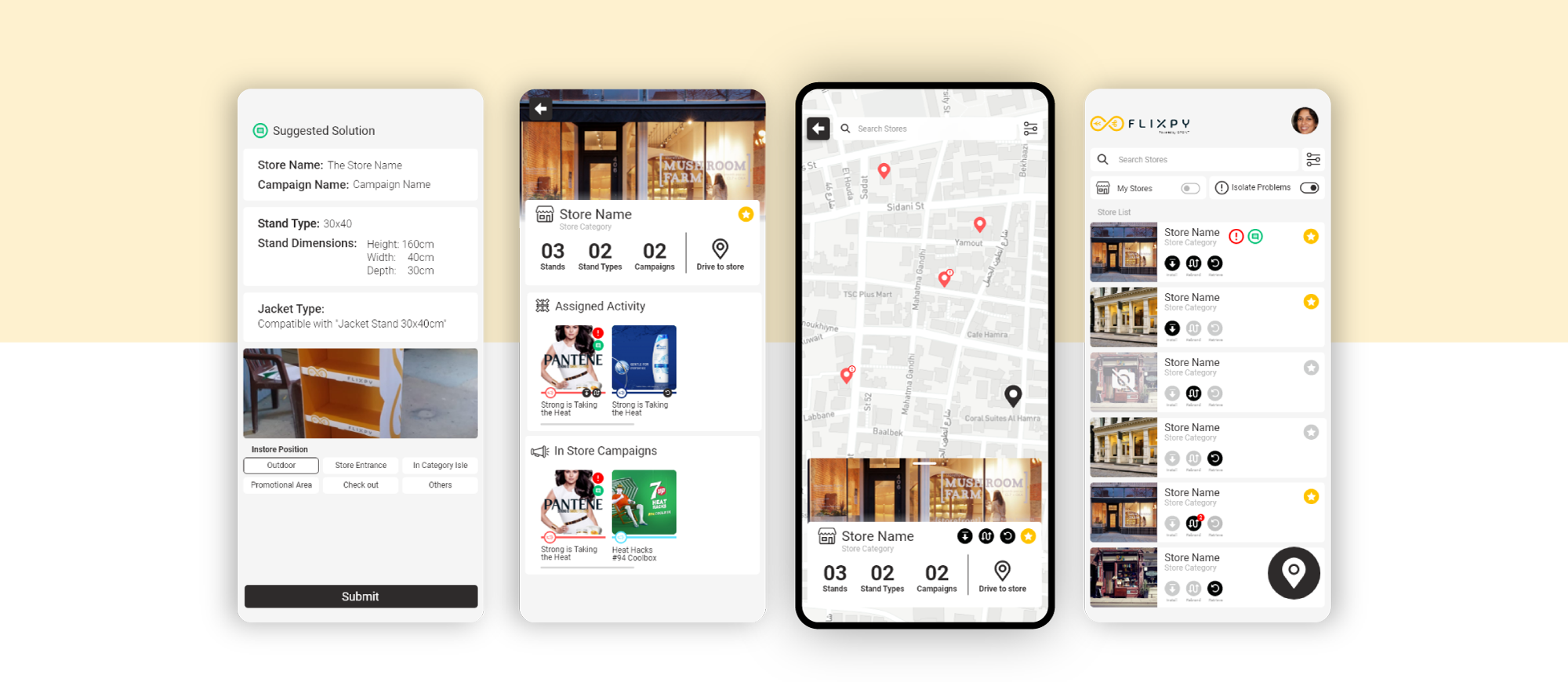
The field force app was designed to be just as efficient as the manager app. It includes tools for the field force to provide helpful data for both themselves and their manager, and is carefully designed to guide the field force through each step to avoid mistakes. The app helps the field force to organize their day and provides them with a list of addresses and tasks to complete at each location.