hello@elierachkidi.com
+33 7 51 26 99 27
Elie Rachkidi © 2022


menu
close
IO Point is a long-term collaboration that reflects the evolution of both the brand and its market. Initially designed several years ago, the identity supported IO Point in its early growth phase. As the company expanded, matured, and redefined its positioning, the original identity no longer reflected who they had become. Years later, IO Point reached out again to lead a full rebrand; building on trust, continuity, and a deeper understanding of their vision.

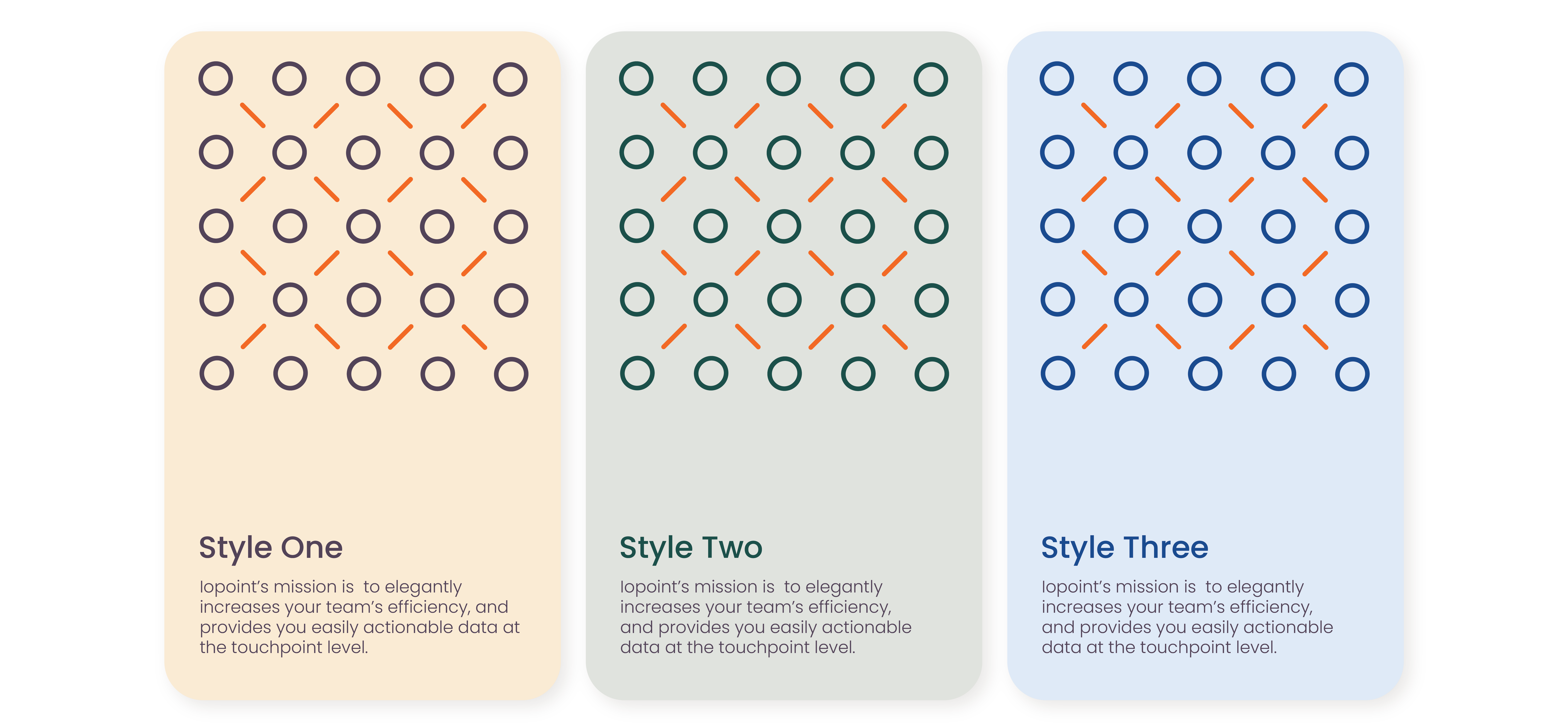
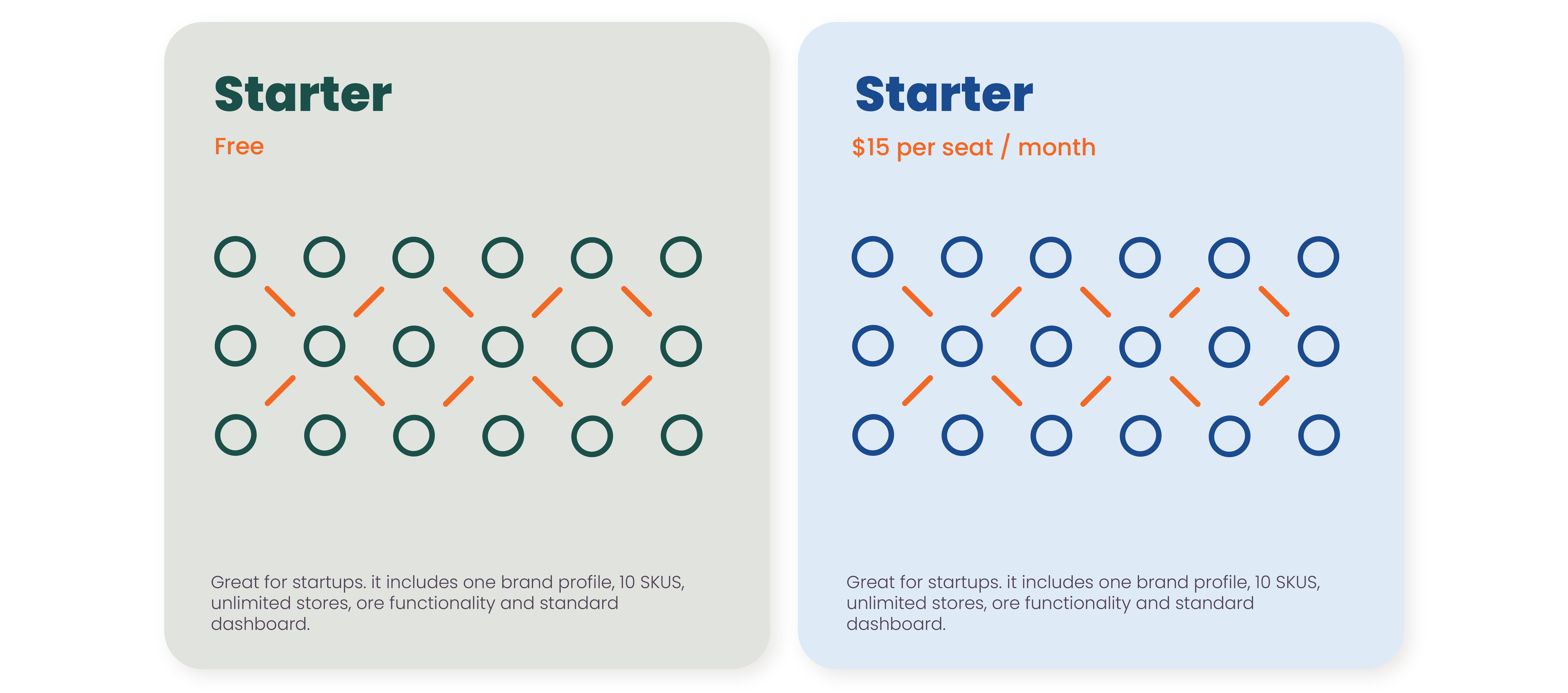
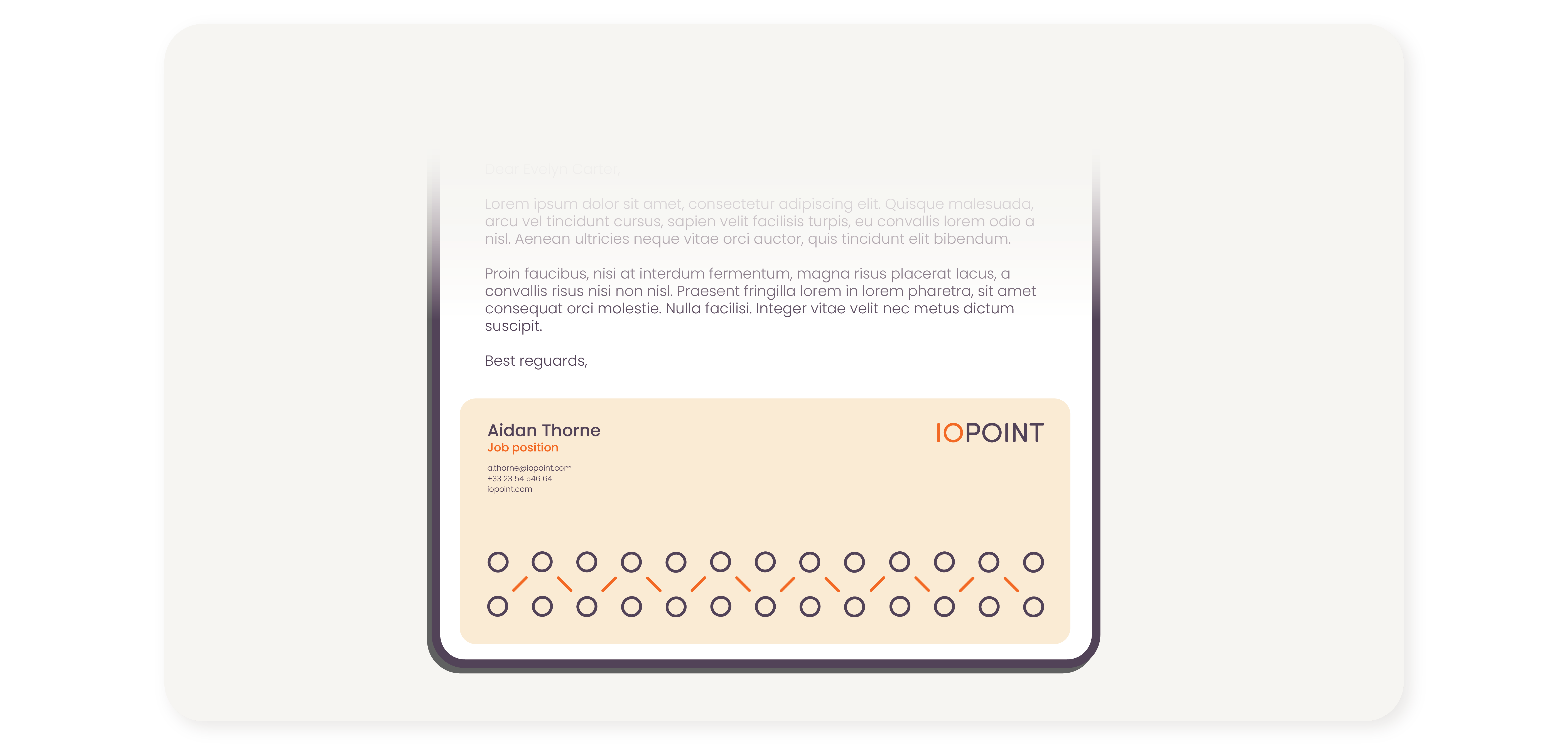
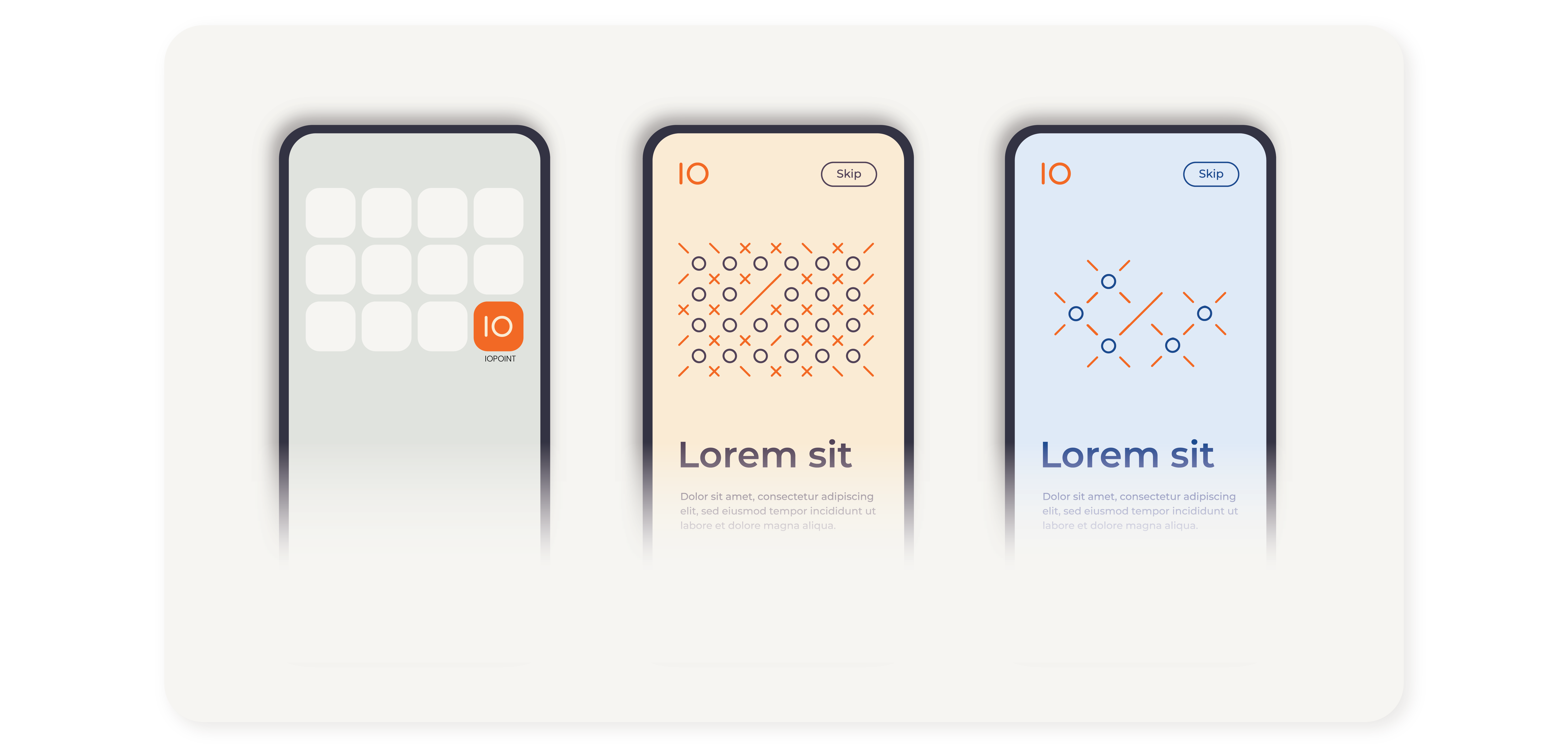
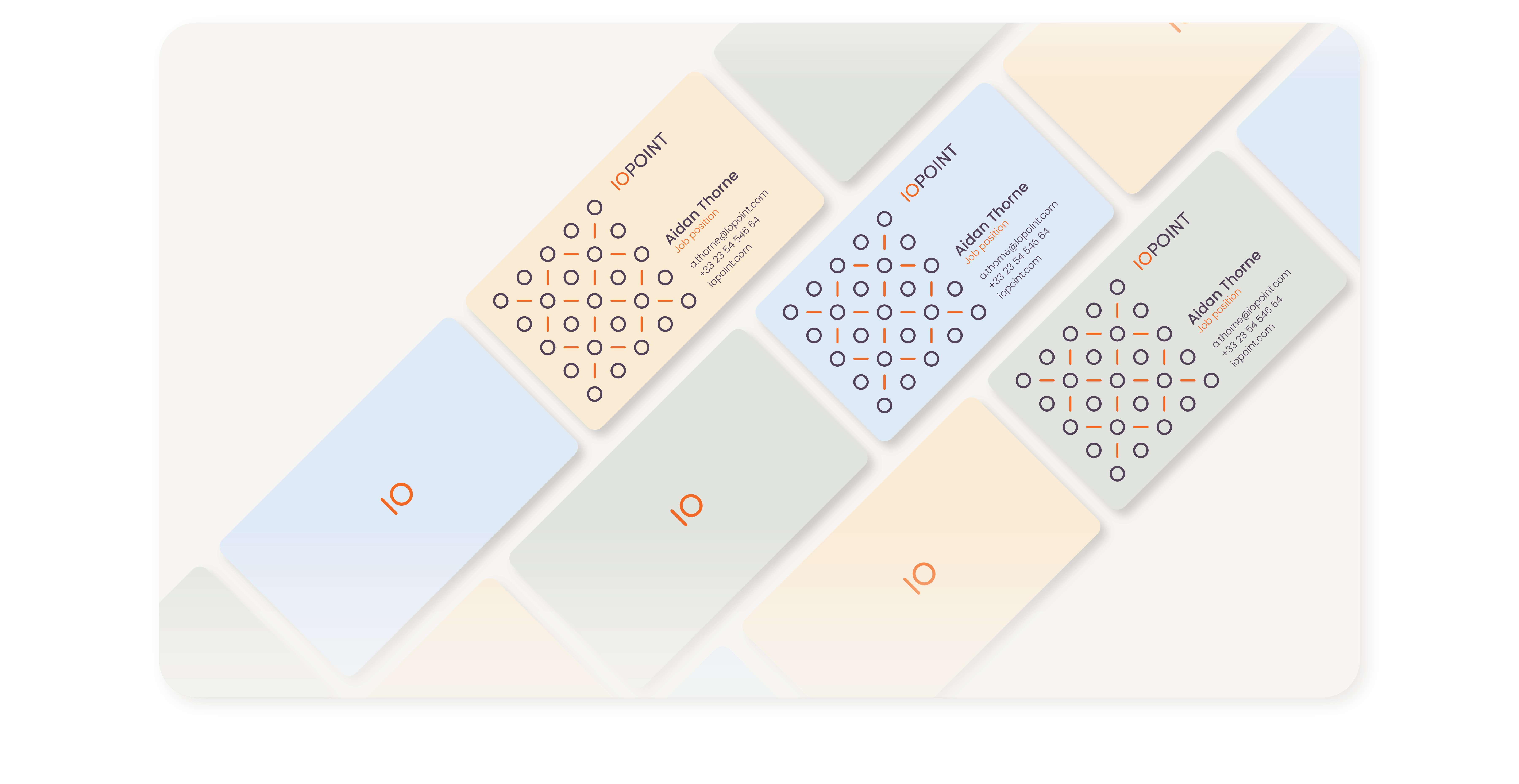
The logotype relies on a single, consistent typographic system, while color separation is used deliberately to highlight meaning rather than decoration.
This restrained approach establishes a solid visual foundation; one that allows simple geometric elements to evolve into a larger system of connections

The circle becomes a central point, while the line acts as a connector; together forming modular units that can expand, repeat, and interact.
This system reflects IO Point’s role: connecting data points across the field to create clarity, structure, and actionable insight.
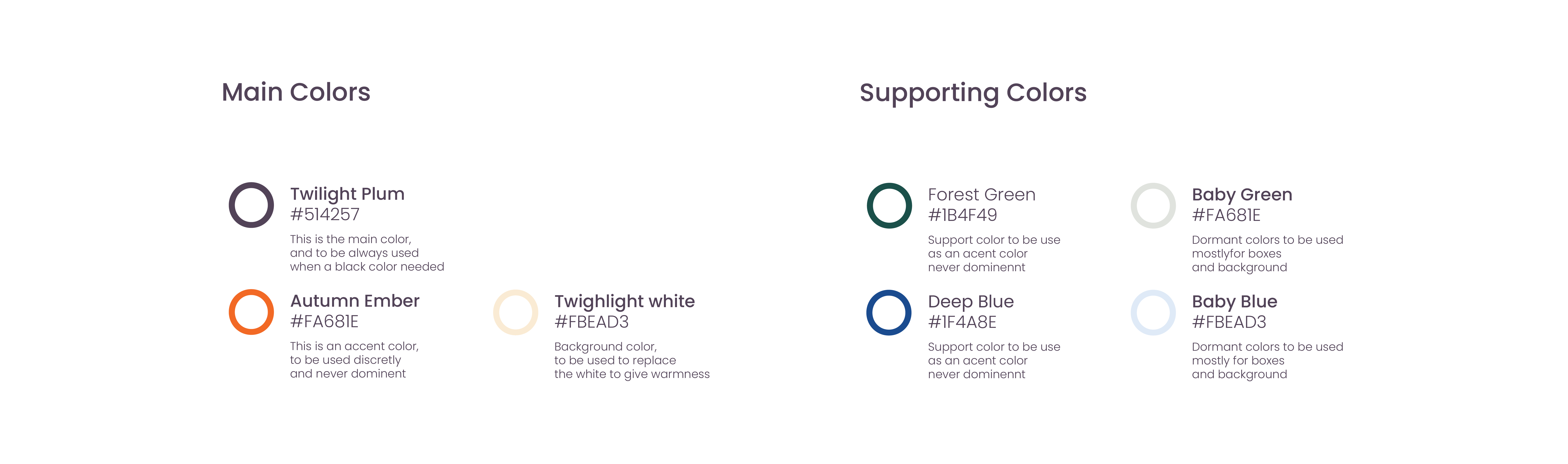
By combining a consistent set of shapes with a controlled color palette, the identity can generate multiple visual styles while remaining instantly recognizable. Each variation expresses a different tone or context, yet all belong to the same coherent brand language.